Thursday, 29 March 2012
Friday, 23 March 2012
Thursday, 15 March 2012
Who Are You? Development
Who are you?
Editing image to suit the DPS
I chose this colour scheme from the colours that Tom prefers and uses often.
These icons are for a graph of Tom's favourite and least favourite things.
Basic Modernist Layout
Different variations
Simple but effective decoration
I added a halftone dots picture to give it a bit of mystique and i don't think tom would appreciate a big cheesy grin picture.
Pink circle with multiply blend mode, off centre.
Second Page
I extended the title banner to connect the two pages so they run more fluently.
A simple graph displaying Toms favourite and least favourite things as he is into his infographics and formal information.
Adding in the Content:
Layers:
Final spread:
Tuesday, 13 March 2012
Post Modernism & Communication- Publication
For my publication I want to research further into post modern graphic design, the information I am going to put in the publication will be factual and informative of the movement and notable designers from the movement, as well as designers that reflects elements of post modernism in their contemporary practice.
The aesthetics and layout of the publication will explore readability and legibility and push the boundaries of communication.
I am going to research a wide range of post modernist designers as well as the social and historical context that they were working in.
Recap of Post Modernism Lecture Notes:
Moscoso
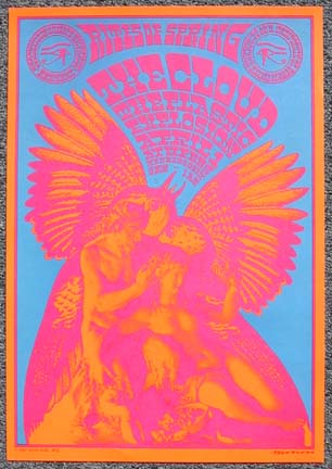
Art Chantry


Jamie Reid

The aesthetics and layout of the publication will explore readability and legibility and push the boundaries of communication.
I am going to research a wide range of post modernist designers as well as the social and historical context that they were working in.
Recap of Post Modernism Lecture Notes:
- A reaction to the rules and 'Form follows function' of Modernism.
- Beginnings in the 60's, recognisable in the 80's
- An attitude of questioning convention.- no rules
- Robert Venturi: "‘I like elements which are hybrid rather than ‘pure’, compromising rather than ‘clean’, distorted rather than ‘straight-forward’, ambiguous rather than ‘articulated’, perverse as well as impersonal….’
- Sampling lots of different elements.
-
Rejection of technological determinism?- a more hand made approach
Moscoso

Art Chantry


Jamie Reid
Wolfgang Weinart
April Greiman
Kazuma Nagai
Tibor Kalman

I am interested in how sentences and words are still readable even if some of the letterforms have been changed.
Direction:
I am going to produce a series of 3 posters that explore legibility, typography and layout with reference to the post modern graphic design movement.
Thursday, 8 March 2012
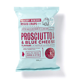
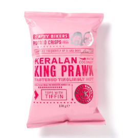
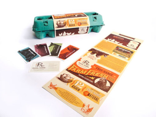
Inspirational Design
All image sources can be found on: http://tumblefingers.tumblr.com/
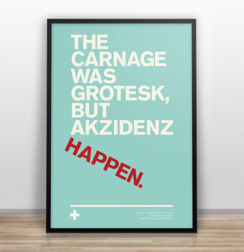
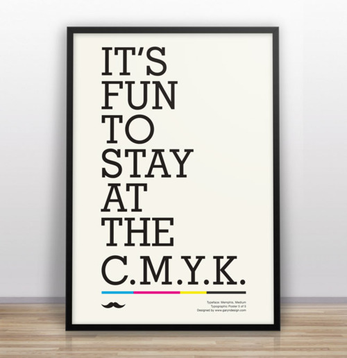
I'm looking forward to doing some branding in 2nd year, this style of branding is right up my street!
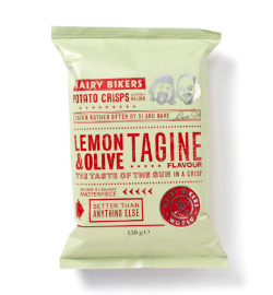


High-res →




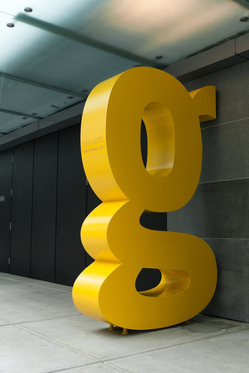
Thinking larger in terms of scale, media and placement.
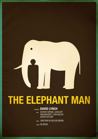
Clever use of negative space
Subscribe to:
Comments (Atom)


