This year the PPP module has been an engaging and successful module. I started the year by sending out a mail shot to a studio which I had a particular interest in at the bottom of Leeds which I had identified as a studio which I had things in common with from previous PPP sessions, called Robot Food. This resulted in going in for an interview and organising a weeks experience in November. I really enjoyed my time at Robot Food and expressed my interest in returning whilst I was still there, I was invited back again in December. Being in the studio has influenced my personal design practice a lot this year, it has given me a more professional and informed way of tackling briefs and has also put more emphasis on research and audience and how it informs design. After Christmas I got back onto Robot Food as they had previously mentioned that they were looking at hiring a junior and managed to organise a third week. During this visit I managed to get involved with a brief more than I had before and impress the guys enough for them to offer me the junior design position starting in June. This was a direct result of the PPP module as what interested Robot Food in me was my experience at Big Fish, as well as my portfolio, as they thought that this company was very good at what they did and they cited them as their personal inspiration. This was a company that I identified last year and managed to do 2 weeks experience with over summer.
I think that continuously finding new work and designers who inspire you is important when it comes to keeping your work up to date and exciting. This documentation and analysis of existing work is something that I want to continue doing in the future as I think that it helps you to decide what aspects of design are important and meaningful and which are just embellishment and stylistic. Throughout the year we have defined what makes us unique as designers and also as people, this time of self reflection has been very valuable and has enabled me to understand who I am as a professional. My presentation skills have also become more natural as we have done numerous presentations and I have found that if you have put the planning time in it takes the nerves out a lot.
Overall I have enjoyed this module and it has been invaluable in educating me about the 'real', non-education side of design and how work changes from being a student going into a professional working environment.

Thursday 22 May 2014
Wednesday 21 May 2014


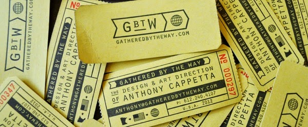
Personal Branding Development
Rather than having a complete branding overhaul I wanted to evolve my current branding a little bit, to make it a bit more refined and crafted.
I wanted to keep the Shuttlefingers theme and push the idea of space travel a bit more

Using embroidered patches as inspiration I designed a more isometric logo that sits in a circular lock up


On the rear of the card I wanted to elaborate on the airborne/ space travel theme


The branding consists only of blue and red to maintain a optimistic and strong identity
Original Invoice


Tuesday 13 May 2014
Personal Branding Research
I want my branding to be interesting and exciting rather than being strictly minimal and standard as I think this reflects my practice more accurately.

It doesn't want to be too hectic as something like this becomes confusing and hard to digest visually.


Colours similar to these have high impact and would lend themselves well to the Space Mission patch motif


I am going for something along these lines to elaborate on the 'Shuttlefingers' brand


I really like this stamp/ traditional aesthetic but it may not be relevant for this brief


I also like branding that incorporates a lot of visual material rather than just using 1 logo across a lot of different deliverables


This typographic treatment works very well and would stand out against the standard, sans serif, minimal branding that is popular among designers.


Friday 9 May 2014
Thompson Brand Partners - Portfolio Surgery
8/5/14
The Thompson visit was very useful, I presented the portfolio boards below and Jimmy gave some helpful feedback on what projects to emphasise, which photos to capitalise on and which ones aren't showing the work in the best light.
Overall feedback was positive for the projects, some of the suggestions were to:
- Include some brief descriptions that outline the work incase someone is looking through it without me present.
- Include some diagrammatic illustrations to communicate the audience of the project etc.
- Include more digital mockups rather than entirely photography- to show range clearly
- Label things that studios would be looking for such as 'tone of voice', 'colour palette' etc.
Subscribe to:
Posts (Atom)