Based on the exercises, feedback and discussion in the module so far:
Part 1 - Identify document and evaluate a minimum of 10 examples of professional designer's and/or design studios who have used a range of media and formats to distribute samples of their work. You should aim to select a range of examples using a rage of media.
Part 2 - Produce a short (50 word) SWOT analysis of each example in order to analysis its relative merits and effectiveness as a promotional tool or strategy.
- Strengths: characteristics of the business or project that give it an advantage over others
- Weaknesses: are characteristics that place the team at a disadvantage relative to others
- Opportunities: elements that the project could exploit to its advantage
- Threats: elements in the environment that could cause trouble for the business or project
Printing onto products such as bags: This gives the target audience something they can actually use and keep which will recurrently bring you promotion, as opposed to a mail out that may get binned or looked at once and ignored. If the audience is interacting with your brand etc. regularly then you will be at the forefront of their mind when they have a space for a placement.
Opposing this it may be forgotten that it has anything to do with somebody after a placement and just be used for its functionality
Standard mail out with business card insert:
This comes across as very mature and professional, targeted at the right audience this would be effective, to a company that specialise in considered and minimalistic design.
This will be mailed and may get lost in the rest of mail outs the company receives.
Adding little features will make the work stand out against the norm, this person has used wax stamps to give the work more importance and also used a concertina fold which makes the work more interesting than just a standard leaflet etc.
A potential threat with this is that the audience wont read it all and the work that is pictured is only snippets and you can't instantly gauge what sort of designer this person is.
This designer has packaged herself as a product, this explains what the target audience will be receiving if they offer her a placement and also illustrates her creativity. Somebody receiving this would be a lot more likely to be inquisitive and interact with the product rather than something more ephemeral like a leaflet etc.
This designer has put his CV in info graphic format and used a simple brand with basic mailers. This is quite boring in comparison to some other CV's and the skills that are listed are expected of designers asking for placements. I don't think this branding and these formats are effective enough for grabbing attention and standing out from the crowd.
This mail out is quite elaborate, giving the audience free things is bound to get you on their good side.
This pack is really interactive and would get the audience engaging with the products. However as there are a lot of loose bits of material it will be easy for them to get lost or ignored. I think that it is more effective to create a bold statement that is memorable rather than bombarding them with loads of bits.
This is quite a poor mail out, apart from being aesthetically boring it is a very standard format and doesn't provoke the user to follow anything up or look any further into the persons work.
This mail out takes a much more modernist and mature approach, again, this will be very effective if sent to the right people, it shows the designer has a good understanding of grid and typography and instantly communicates what sort of work he is interested in.
I think that this is a very effective send out pack, it is instantly engaging and stands out from the rest. This gives an impression of the character of the person, the only negative with this is that it is quite small and could easily be lost or forgotten
I think this is the worst mail out, there is no chance anybody is going to stick this up on their walls apart from maybe this guys mum. And because it is so big it would be difficult to handle and read the information. Inappropriate format for the function of a mail out.
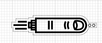
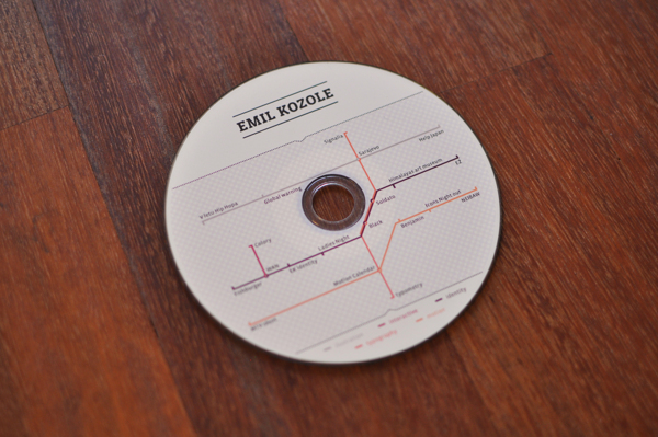
Using a CD to deliver work is a bit different to just a leaflet and there is an air of mystery around what might be on the CD so this may encourage the audience to play it and look at it.
It is also a nice idea to wrap the disc in samples of her work as this is much more considered and nicer to handle than if it were in a clunky plastic case
This girl has also branded herself as a product this raises the opportunity to put together an elaborate pack of lots of things that the audience can interact with. Targeted at the right peoples this would be effective.
This is promotional material done by Two Times Elliot, making a range of deliverables that come together to make a coherent whole is quite effective. The problem with mailing multiple things to a studio may be that they don't make the connection between the separate pieces or they are read in the wrong order etc.
Although info graphic CV's often look tacky and crap I think this one is done well, mainly because the designer is proficient in a lot of software and can actually brag about it, when the info graphics for DW or Flash are about 2/10 it doesn't look great at all. This CV would also work very well as a digital mail out.